This Signs and Wonders focuses on making communications that people actually SEE: that grasp their attention.
[Of course, no one expects visibility alone to change the world, but if we’re invisible we’re not even in the game!]
Playing in the wacky zone
The trick to grabbing attention is to surprise and break stereotypes, which means that, as communicators, we need to be able to surprise ourselves!
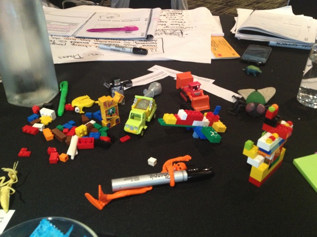
So how could we do that? I’ve been experimenting with some simple ways to encourage out-of-the-box creative thinking. Last year I did a crowd-sourcing experiment that provided a pile of cool ideas. Since then I’ve been trialling some in workshops with professional agency staff. Here’s a post that shows a few methods that definitely work (and are fun).
Some cool examples of wacky (stereotype-busting) campaigns:
A recent Australian classic is, of course, McCann Melbourne’s “adorably morbid” Dumb Ways to Die for Melbourne’s Metro Trains. 70 million Youtube views and scores of parodies, can’t be wrong. If (somehow) you haven’t seen the original, this is it. Enjoy.
 And here’s the Rio version.
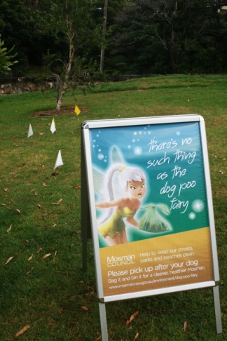
The poo fairy won’t pick it up for you!
Mosman Council borrowed “There’s no such thing as the poo fairy” campaign from Keep Britain Tidy’s effort. Here’s how it looks in Mosman parks…with little flags on the doggy poos. Nice work.
 Crapman, every kid’s role model
Zoo Victoria conservation campaigns put most of us to shame for their sense of fun and adventure in support of important causes. A nice example is Wipe for Wildlife that encourages kids to badger their parents to switch to recycled toilet paper. According to Director, Rachel Lowy, 33% of participating families switched.
http://www.zoo.org.au/get-involved/act-for-wildlife/wipe-for-wildlife
Incidentally, I’m love Zoo Victorian’s strategic thinking. Here’s an example:
Illegal mining of Coltan, the source of tantalum capacitors used in mobile phones, funds militias which are destabilizing the eastern border of the Democratic Republic of Congo, threatening gorillas with extinction. Zoos Victoria’s They’re Calling on You campaign has so far recycled 95,000 mobile phones to raise over $180,000 for gorilla conservation. That’s a different angle on “closing the loop”.
 Visualising a bad cactus
Harrisia is a bad cactus that’s causing havoc on farmlands around Goondiwindi in Qld, and over the border in NSW.
Waggamba Landcare needed a simple way to to alert farmers to the threat. The solution was to demonise it. The resulting poster uses shame to motivate action by farmers who are “growing it”. It’s a simple image that efficiently communicates: “This guy is muscling onto your good land. Run him outa town!”
(Les helped create it for Waggamba Landcare.)
 What killed Dino?
Heatwaves are set to take an increasing toll on Australians’ health. Typical Emergency Services communications are unlikely to be effective to getting people to prepare, for lots of reasons, one of which is that they are so predictable they are almost invisible.
Here’s an alternative visual approach (developed by Les for the City of Port Phillip’s Weather Ready program).
It aims to be fresh, noticeable, and get to the point quickly, without the usual explanations, background, justifications and cognitively demanding “5 step action plan”.
 Communicating good cycling behaviour
With so many men turning to bikes for exercise, and many having not a clue about good behaviour on shared paths, it’s getting scary to be a pedestrian, especially with children around.
To communicate shared path protocols, the message has to both be easily seen and simply, precisely communicate what the desired action is.
Here’s a way to do it:
http://changeologyblog.wordpress.com/2013/11/19/communicating-good-cycling-behaviour/
Sweden’s Largest Energy Experiment
One of the challenges with designing energy conservation campaigns is that energy is invisible.
 E.ON, the Swedish energy company, reduced energy use by 12% (a HUGE amount!) with a campaign that was also an experiment: what if people could see how much energy they were using?
10,000 participants were given an app, connected to a smart meter in their homes, that visualized their household energy use in different ways:
– real money spent in real time
– a virtual battle with other households to save energy
– a mean coach spurring them on to save more
– a cute Tomogouchi that died if you didn’t save enough.
 What visualisation worked best? The company didn’t say…but altogether the 10,000 participants cut their energy use by a wopping 12%.
Another nice idea they used was to invite the public to share their energy saving tips. The campaign converted them into cool cartoons, printed in booklets, distributed nationally, and displayed on billboards.
The video is worth watching: http://www.youtube.com/watch?v=DW7cG2yEV84
About the campaign: http://www.fb.se/work/eon/swedens-largest-energy-experiment
 Take 3
Here’s another neat angle on visualisation. What if the name of the campaign, alone, told you exactly what to do?
This is the beach anti-littering campaign of highly-motivated surfer, Tim Silverwood.
Take 3 is a simple idea “take three pieces of rubbish with you when you leave the beach.”
All you need to know is the name (plus Tim’s cool surfing charisma).
Making climate change visible
With super cyclone Haiyan smashing the Philippines, and a burning hot summer at home, Climate Change is getting very real, but for a lot of people it’s still invisible and often happening somewhere else. How can we help people see it?
 What I love
To help climate change touch home, here’s a nice idea from The Climate Reality Project. Just like iconic species have helped rally efforts to save biodiversity, so maybe climate change has its iconic threatened species too…like cheese, beer, rice, coffee and skiing!
Select 8 things you love (water, bananas, freedom, home improvement, Tokyo) and see what climate change will do to them, then do something about it.
http://www.whatilove.org/
 Globaia: visualising climate change
Globaia is a data visualisation company that have produced some beautiful and awe inspiring videos depicting impacts of climate change. Here are a couple that would make any audience take notice.
Welcome to the Anthropocene: http://vimeo.com/40940686
Climate Change – The state of the science: http://vimeo.com/75038049
Sydney: 1-2 April
Melbourne: 29-30 April

Innovation Seedbox: Creative solutions for tricky problems
A one day “innovation lab” to put an inventive zap into your service or project. Our promise: you’ll be excited by the solution you create! Plus you’ll prepare the perfect pitch to sell your idea. Full details.
Sydney: 10 April
Melbourne: 2 May
Facilitation Skills: Facilitate any gathering with confidence
Facilitation is a change maker’s core skill. Les shares the skills and tools to productively facilitate almost any group in almost any situation. Full details.
Sydney: 8 April
Melbourne: 1 May
